


Results 1 to 10 of 22
Threaded View


-
22nd Mar 2010, 04:22 PM#1


 OPლ(ಠ益ಠლ)
 Website's:
extremecoderz.com [TUT] Image-less Round borders
This very small tut shows how to create round borders without using images or tables or CSS3.
Firstly let me explain why image-less borders are better.
For a start, it means you do not have to download the images. It may be 4 or even up to 8 images being downloaded. Depending on the ability of the coder, it could be a sprite, but again, a http request needs to be made, and a (sometimes) large sprite needs to be downloaded.
So this example, an image-less rounded border uses text only, resulting in zero extra http requests and inevitably faster page-loading.
Ok. So the CSS:
There are 2 ways we can do this. One with an outer border-color, and one without.
CSS with border:
CSS without border:Code:<style type="text/css"> .b1f, .b2f, .b3f, .b4f{ font-size:1px; overflow:hidden; display:block; } .b1f { height:1px; background:#888; margin:0 5px; } .b2f { height:1px; background:#ddd; border-right:2px solid #888; border-left:2px solid #888; margin:0 3px; } .b3f { height:1px; background:#ddd; border-right:1px solid #888; border-left:1px solid #888; margin:0 2px; } .b4f { height:2px; background:#ddd; border-right:1px solid #888; border-left:1px solid #888; margin:0 1px; } .contentf { background: #ddd; border-right:1px solid #888; border-left:1px solid #888; } .contentf div { margin-left: 5px; } </style>
Code:<style type="text/css"> .b1f, .b2f, .b3f, .b4f{ font-size:1px; overflow:hidden; display:block; } .b1f { height:1px; background:#ddd; margin:0 5px; } .b2f { height:1px; background:#ddd; margin:0 3px; } .b3f { height:1px; background:#ddd; margin:0 2px; } .b4f { height:2px; background:#ddd; margin:0 1px; } .contentf { background: #ddd; } .contentf div { margin-left: 5px; } </style>
The Main CODE:
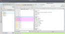
And here are the results, depending on which CSS you decided to use:Code:<b class="b1f"></b><b class="b2f"></b><b class="b3f"></b><b class="b4f"></b> <div class="contentf"> <div> KWWHunction ftw.<br /> Content Goes Here<br /> </div> </div> <b class="b4f"></b><b class="b3f"></b><b class="b2f"></b><b class="b1f"></b>
Border:

No-Border:

The "rounded boxes" can be re-used time and time again in the same code simply by using the main code again and again jayfella Reviewed by jayfella on . [TUT] Image-less Round borders This very small tut shows how to create round borders without using images or tables or CSS3. Firstly let me explain why image-less borders are better. For a start, it means you do not have to download the images. It may be 4 or even up to 8 images being downloaded. Depending on the ability of the coder, it could be a sprite, but again, a http request needs to be made, and a (sometimes) large sprite needs to be downloaded. So this example, an image-less rounded border uses text only, Rating: 5


 Register To Reply
Sponsored Links
Thread Information
Users Browsing this Thread
There are currently 1 users browsing this thread. (0 members and 1 guests)
Similar Threads
-
how to thicken the blog post and gadget borders
By Breaking Bad in forum Technical Help Desk SupportReplies: 0Last Post: 15th Dec 2011, 01:27 PM -
Borders
By gmaister22 in forum vBulletinReplies: 3Last Post: 17th Aug 2011, 08:29 PM -
Website with rounded borders.
By -Im.z2ight- in forum General DiscussionReplies: 2Last Post: 4th May 2011, 10:05 AM -
Best all round script ?
By ThaGoon in forum Webmaster DiscussionReplies: 0Last Post: 11th Mar 2011, 10:44 PM -
round robin dns service
By priviet02 in forum General DiscussionReplies: 2Last Post: 26th Jan 2011, 12:11 PM


 Staff Online
themaPoster - post to forums and...
Version 5.12 released. Open older version (or...